Pairing typefaces in book design

Choosing typefaces is one of the two most important choices you make when designing a book. Aside from a cover photo or illustration, it’s the detail that is most “out there” in front of readers. In this short piece, book designer, page compositor, and layout artist Stephen Tiano shares advice on best practice for combining fonts.

Typeface characteristics

Fonts* used on a book cover make the initial reading impression and, when properly chosen, prepare readers for how the reading experience will feel when they turn to the first page.

I know of two ways to select typefaces for book projects. First, the lazy — though not necessarily uninteresting way — is to choose superfamilies comprised of both serif and sans serif fonts. The other way is arguably the more creative way, and is what, intuitively, one expects to pay a book designer to do: dope out perfect matches for each book he or she works on.

A few of my favorite type superfamilies are Fontin/Fontin Sans, Liberation Serif/LiberationSans, and FF Scala/FF Scala Sans. (As a bonus, both the Fontin superfamily and the Liberation superfamily are open source — that is, free to use.) There’s also an interesting list of forty superfamilies in an article on Peyton Crump’s Viget Inspire blog. Stay on your toes, however, as not each of these pairs is suitable for making books.

The second way to pair types is the “hard,” creative way; the doping-it-out kind of way, where the book designer does the matching. And that leads to the two ways to pair serifs and sans serifs: by contrasting or by matching.

Contrasting, at first blush, is by far the easier of the two ways to work out pairings. Theoretically, nearly every difference provides contrast.

Some obvious points to compare are letter height, x-height, stroke weight, character shapes, and direction of the axis (vertical or angled). The most practical contrast, however, when using serifs and sans side-by-side are roman to bold — the more extreme, the better; and size — one of the fonts should be at least a few points larger than the other.

When matching types, there are certain combinations that work naturally, because of the weights, shapes, and proportions of the characters. Oldstyle Serif types, with their angled stress and mild difference between thin and thickness of stroke, pair nicely with Humanist Sans Serifs — Minion and Frutiger, for instance (both available from MyFonts).

Other Oldstyle Serifs such as Jenson, Bembo, Caslon, Garamond, Palatino, and Sabon, combine well with other Humanist Sans Serifs such as Eras, Gill Sans, and Lucida Sans.

Transitional faces have a vertical stress and the contrast of thin and thickness of a character’s stroke is more obvious than with Oldstyle faces. Some examples of Transitional Serifs are Bell, Bookman, Bulmer, Caledonia, Joanna, Mrs Eaves, New York, Perpetua, and Times Roman typefaces. Transitionals are paired well with Geometric Sans Serifs such as Avant Garde, Avenir, Bernhard Gothic, Century Gothic, Eurostile, Futura, Kabel, and Univers (all available from MyFonts).

Modern typefaces have much more pronounced contrast between the thin and thick of their stroke than the Transitionals, and larger x-heights. Examples of Moderns are Bernhard Modern Roman, Bodoni, Didot, Fenice, New Century Schoolbook, and Walbaum (all available from MyFonts). Geometric Sans Serifs, as with Transitionals, make nice pairings with Modern Serifs.

For book design, I stop here, except for my desire to sometime set a book in Optima, a Near-Serif Sans.

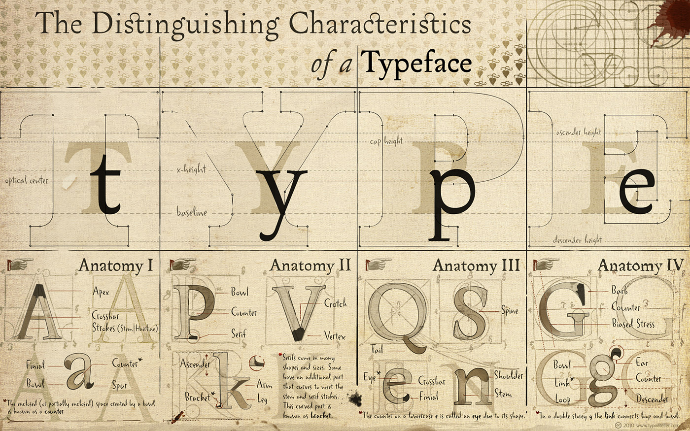
*A word on the two separate and distinct terms, typeface and font. A typeface is the name under which all the characters (letters, numbers, punctuation marks), in all styles (roman, italic, bold, etc.) and sizes, of a particular design are unified. A font is a typeface in a single size and a single style. So Bembo is a typeface, but 10 point Bembo Italic is a font.


Many thanks to Stephen Tiano for sharing his knowledge.

Font combination resources

combining fonts


Comments

25 responses to “Pairing typefaces in book design”

  1. Great resources and exactly what I was looking for today. Good timing!

  2. Well, James, I’m not sure whether you’re compliment is, generally, for my guest piece or for David’s helpful links, but I’ll say thanks nonetheless. Typefaces, of course, are either number 1 or 2 in terms of what a book designer thinks about when starting a new project. And besides, they’re kind of like the toy or candy part of a designer’s arsenal.

    One thing I’m always struck by is how there seem to be way more new display typefaces than ones meant for body text in books. So I tend to have high hopes whenever I see mention of a serif type that I’m not familiar with. Consequently, I’m forever open to hearing about new serif faces. Especially ones that pretty quickly strike about any type veteran as having something, anything, new-looking about them.

  3. Sometimes it helps to pair serifs and sans-serifs by designer. For instance Adrian Frutiger’s “Frutiger” and “Méridian” go well together. As long as the inner structure is basically the same you should be good to go.

    Thanks for the article and links James!

  4. Melissa Avatar
    Melissa

    Thanks for the post, Stephen! I usually only notice the design of book type when it is exceptionally bad, or so lovely that I hunt (often in vain) to see if the typefaces have been listed somewhere at the front or back of the book.

    Do you ever have to take paper quality into consideration when you do book type design? Although I suppose this to only be an issue with cheaper books…

  5. I don’t, Melissa. I leave that to my clients and their printers. I very rarely talk to my clients’ printers at all–just once in a while, usually to get job option specs straight for distilling printer-ready PDFs.

  6. Thank you for interesting article and fonts collections.
    While at sea I often print books for reading, but always use Times New Roman, as never before was thinking about fonts importance.

  7. I’m curious as to why you choose to mention Lucida Grande in a post about book design. There are so many humanist sans typefaces designed for print, it seems odd to recommend a typeface designed for screens. And the fact that it has no italics will surely cause problems when typesetting a book.

  8. Fair point, Matt. I’ve never made the jump to using sans serifs for body text in books. Long stretches of sans serif just don’t agree with my eyes, so I take the rather old-fashioned view (I suppose) that sans serifs are not for body text. But I do use it for display heads and tabular material. And I usually makes sure I’m not going to need an italic. (Well, almost … I have worked on one book where I used a sans serif for display but did run into a coupla instances that required itals. I dmit to cheating and skewing the type for a homemade oblique.

  9. I should add, Matt, that if I didn’t like how the “homemade oblique” looked, I wouldn’t have done it; I would’ve found a new sans serif. But I actually liked the effect.

  10. I just worked on a children’s book and had to deliberate at great length over appropriate fonts. It took me a long time to find something that fit with the style of the book.

  11. Amazing article. It’s only recently that I’ve really started to care about combining different typefaces. However, I’m a website designer, not a book designer… I still try and approach it in the same manner. Though obviously certain combinations which would work in print just wouldn’t work on the web.

    Added this awesome article to my pinboard, and put your nb as a quotation on my blog.

  12. That’s pretty cool, Jules. How did your process work for selecting fonts for this children’s book? Did you go with a matching strategy or a contrast? Did you measure up against what the story was about or more along the lines of where and when it was set?

  13. It’s funny, Luke, maybe 10 years ago already (or about whenever it was that Apple introduced OS X with Jaguar), I was going thru a dead winter. I mean D-E-A-D. I couldn’t buy a book design project to do. So I began working on what I felt would be the inevitable transitioning to web design. I wasn’t just thing sites, but web apps. I put in serious time studying PHP and MySQL. I was more comfortable with that than the look of pages, perhaps because web typography was nowhere as near as advanced as it’s gotten to. So I’m curious, since it sounds like decent typography is now workable: Considering what I wrote about picking types for book design, what kind of process to you go thru for choosing them for web design?

  14. Stephen – that’s quite a drastic transition. You went from something visual creative to something logically creative (two different sides of the brain). I’m assuming that it didn’t last?

    I’ve been designing for the web professionally for about 2 years or so now, but have been practicing and doing it for more like 7 years. Over the past year or so web typography has accelerated at a tremendous rate. You’re no doubt aware of services like TypeKit which now allow easy embedding of typefaces which are only now easy to access for many designers. That’s made typography in design way more workable. We’ve still the problem of cross-browser and cross-os type rendering to overcome.

    The process for me in design depends to be honest. As mentioned in your article, an attractive process is always to go with the superfamily approach… Choosing combinations such as Museo Slab, Sans & Serif, which look great but are sometimes a bit too obvious. Other than that, it’s just testing out combinations which I think may work but something just won’t. I like to visually go through and look at the typefaces available.

    Fortunately, TypeKit comes with fantastic faceted navigation so it’s really easy to find a nice slab serif with a nice text serif (pour example).

    I really must emphasise that it’s only been the past 4 months or so that I’ve been interested in the emphasis of typography online, so I’m still reading, learning and trying out as many different methods as I can. Hence the reason the only two personal sites I have are perhaps not where I’d like them to be, but hopefully will be in the near future. Well, one of them anyway: lukejones.me. The other (Traxor Designs is a “farewell” message to the guys who visited the site and my clients.

    If you’re interested, the typefaces used on my site are FF Meta Web Pro (main text throughout site), Proxima Nova (headings) and FF Tisa Web Pro (any serif fonts on the site, such as blockquote).

  15. Well, I never quite made the transition, as books got busy for me after a bit and–since they’re really my abiding work interest (oh, okay, my first love)–I haven’t looked back. I must say, tho’, that I was always a math person in school, even tho’ I wrote. And so, even tho’ print design–specifically books–are my area now, I still consider myself math-y and there’s a part of me to which coding and app design, if not outright programming, appeals.

    Yes, I’ve heard of TypeKit. Even tho’ I’m not designing on the web, I’m still relieved that better typographic tools are now available for web use.

    Even when using superfamilies, I think it’s important to choose with some kind of connection between the typefaces and the material in mind. I admit, tho’, I don’t know if finding such connections is a noticeably less intuitive process than with print books.

  16. I’m currently working on a project for people who have reading difficulties, so I can testify to how important typeface choices and combinations are .

  17. Absolutely, Richard. I don’t know if your project is a book, a piece of advertising, or what, but the basic idea’s the same: Make it easy for the reader to stick with their reading. The typeface(s) used are a big part of that equation. So is size and leading of the type. Together with the size and proportion of the text area the type pretty much defines the reader’s experience. They all make up a kind of invitation to the reader to come on in and read. It only takes a look for the reader to decide whether the page you’ve made is comfortable for them. But at the least you have to give them that much, and then the writing will have its chance hook them.

  18. Stephen, it’s actually educational/training material, and I totally agree with what you say. At first I wasn’t tremendously excited by the project, but it has been a great learning experience and I can already see how things I’m learning through it can be used in other applications. Great site, by the way.

  19. Having done some textbook and workbook work, I’d say it’s even more important to make the reader’s experience as comfortable as possible withe educational/training materials.

    This site, by the way, is David’s, not mine, so the kudos for it belong to him.

    My site is at http://www.tianobookdesign.com

  20. Incredible post! I never get tired reading your articles. Keep on posting. 🙂

  21. Stephen, I meant your site – I had a look at some of the work you’ve done and liked it a lot.

    I think David already knows I like his site(s). 🙂

  22. In that case, Richard, thank you. I must also admit, however, that even tho’ I’ve studied Dreamweaver (and PHP and MySQL), I got too busy before I could actually set up my site for myself and wound up hiring someone.

  23. Thanks for an incredibly important and useful post David.

    Typographic consideration is all too often overlooked or ill considered. Usually only until it is blatantly ugly, inconsistent or inefficient.

    Making intelligent design choices can make a world of difference to something as fundamental yet seemingly mundane as text layout.

  24. Funny that you should talk about type as a too often overlooked (or ill-considered) issue. When I first wrote the piece above for my original blog on book design a few years back, it was a two-parter and I wondered whether I was making too much of the subject. Not because it’s not important, but because I couldn’t imagine anyone not already giving type choices proper consideration. I’d like to think we’re more conscious of it now, but I sometimes wonder.

  25. One last thing, if I may–and unrelated to the piece you’ve all been commenting on … I just posted on my own blog, my sort of annual “Four Questions for Book Designers.” For those of you of the book designing persasion, I’d very much appreciate it if you’d drop by and take a few minutes to answer. Bring a friend, too. 😉

    Thank you.

Leave a Reply

Your email address will not be published. Required fields are marked *