Colour in branding

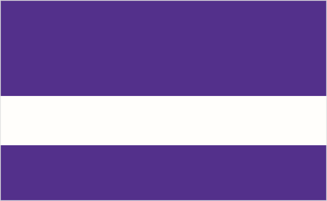
Colour plays an important role in recognition rates. To illustrate, you know what worldwide brands these palettes represent, don’t you? (Answers in the links beneath each.)

brand colour
Brand name

brand colour
Brand name

brand colour
Brand name

Of course each of the above brands has a huge marketing budget, helping ingrain the product or service into our subconscious whether we deal with the companies or not. But try imagining brands that are a little closer to home — ones that perhaps catch your attention when you’re pushing a trolley down a supermarket aisle.

This one’s for a breakfast cereal:

brand colour
Brand name

Here’s a toothpaste:

brand colour
Brand name

And a chocolate bar:

brand colour
Brand name

You’ll undoubtedly see copycat products using similar palettes, hoping to steal some of the market share, but the message is that colour definitely influences a shopper’s choice.

You need a good reason for changing a corporate colour.


Comments

23 responses to “Colour in branding”

  1. Interestingly, I didn’t get a single one correct.

  2. The only colour combo here I could recognise in an instant is cadbury, they pretty much own these colours, which I find remarkable. Fed Ex pretty much own their colour combo but I did not instantly make the connection, this could be something to do with not being remotely interested in delivery firms as a child, where as chocolate was always at the forefront of my mind.
    It is interesting to see how the main supermarket brands have firmly established, constantly assert, their team colours. And is there room for more than 4 supermarket colour combos? not in my small brain.

  3. Interesting. I noticed that I either got them immediately or not at all.

  4. I only got one- BP. Otherwise I got them wrong, even one of my favorite logos, FedEx!

  5. Thanks for the article. I got half of them without a second thought, with the others I’d heard of not long after. It helps that these brands are all over the media, though. I think the BMW blue might be a bit off, though?

  6. great article as always. i didn’t get the second one though?

  7. I agree with Steve Zelle… I either got them straight away (Aquafresh, Cadburys, BP) or not at all.

  8. Although they’re owned by international companies, the last three could have a UK-centric customer. If you’re overseas you’ll know better.

    Steve, FedEx seem to be shifting away from the purple and orange. At least, the main US website shows purple and grey now. I didn’t think anyone would recognise that combo as easily, so stuck with the UK palette.

    Aubrey, you might be right. I lifted the BMW blue from the current graduated logo, so it could’ve been a few different tones.

  9. Hi from Brisbane, Australia.

    Great article. Colour is such a challenge.

    It drives me nuts when a designer sits down to talk to their client about a visual identity/branding, and asks “What are your favorite colors?”

    Heeeeelloooo?

    It doesn’t matter WHAT the client likes. The issue is (Doh!) what their target market likes!

    I’ve finished bitching now. I only got BMW, Cadbury and BP. But I’ll bet if I just caught a glimpse of those colors in context, (rather than on screen like that) I may have gotten more of em.

    Your point is a good one though!

    Cheers,

    Jerry

  10. This a great, fun study to try out. As for results, I got all of them, except, BMW and Aquafresh. I thought the black, white, and blue was Vimeo. Did Aquafresh change their blue? I always remembered it to be, well, aqua in color. And I agree with Cadbury. There’s something to that indigo or purple that’s very distinguishable.

  11. I only got the last one, but that still proves colour branding works. I’m in the UK and I immediately recognised the Cadbury chocolate colour.

    John

  12. The toothbrush brand, I would recognize my national flag before thinking about the brand (The Netherlands).

    I believe that colors corresponding to a brand is also highly area bond. Some colors remind me of national brands before thinking about FedEx. Nice article!

  13. I didn’t know most of the brands. Except for FedEx. I am assuming that FedEx sticks out because I use to be there so often when I was in college trying to get a last minute print out for class.

  14. Interesting thought. I could recognize only a couple of them, I think because of most of the brands listed are not much exposed in our country, however it was a really, really good exercise. Thanks Airey

  15. What an excellent way to get your point across about how important brand colours are! Very quickly and simply explained.

    Reminds me of when you once blogged to say that it’s often easier to ‘show’ clients what you mean than to try and explain it 😀

  16. I got all the ones on top except bp, maybe because I use Shell so I have less exposure. I got didn’t get any of the British ones and agree that I remember Aquafresh being more blue-green.

  17. It’s incredible how necessary trademark color is to iconic logo design. The minute I saw the BP colors, I knew what the logo/brand was! Amazing! However, I was surprised and embarrassed to NOT pick up on the BMW one.

    Very interesting!

    Robin P.

  18. I didn’t get ANY of them

    The fact that they looked like flags confused me 🙂

  19. Interesting – I got 4 correct. Last one could be Cadbury or Milka!

  20. The first one made me think of the Monarch Airlines colours, although their yellow is more yellowy and less orange-like.

  21. I agree with you, David, that the colors should be kept similar or some element of the design should remain when you are doing a rebrand. What if the client wants to change their image and get away from what they once were, however? I had a client recently who wanted me to redesign their logo.. I felt that they would alienate their current loyal customer base if they totally changed the look, but they told me they wanted nothing of the past logo to remain (color, shape, similar font etc.).

  22. Hi Jenny, as long as your client has a good reason to remove any past equity.

    BT Cellnet was getting a lot of bad press, then rebranded as O2. I wasn’t a Cellnet customer, but 02 now provides my mobile and broadband services.

  23. I got FedEX, BP, thought the toothpaste was Colgate, thought Cadburys or Milka for the chocolate and thought Weetabix for the cereal! Thanks for the interesting article.

Leave a Reply

Your email address will not be published. Required fields are marked *