Guinness Extra Cold posters

It’s the fifth anniversary of Diageo’s Arthur’s Day, a promotional event for Guinness. It’s getting some stick this week, but that’s another thing.

I was over on the D&AD Facebook page and spied these posters for the first time, designed by AMV BBDO about 13 or 14 years back. I think they’re a great example of how good ideas don’t need embellishment.

Guinness Extra Cold poster

Guinness Extra Cold poster

Guinness Extra Cold poster

Guinness Extra Cold poster

Guinness Extra Cold poster

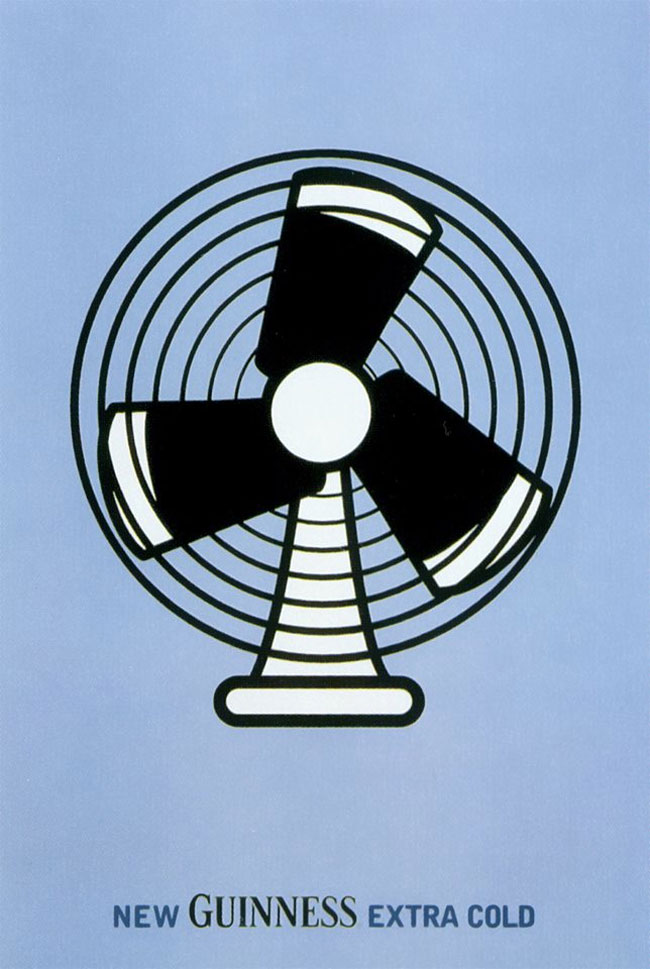
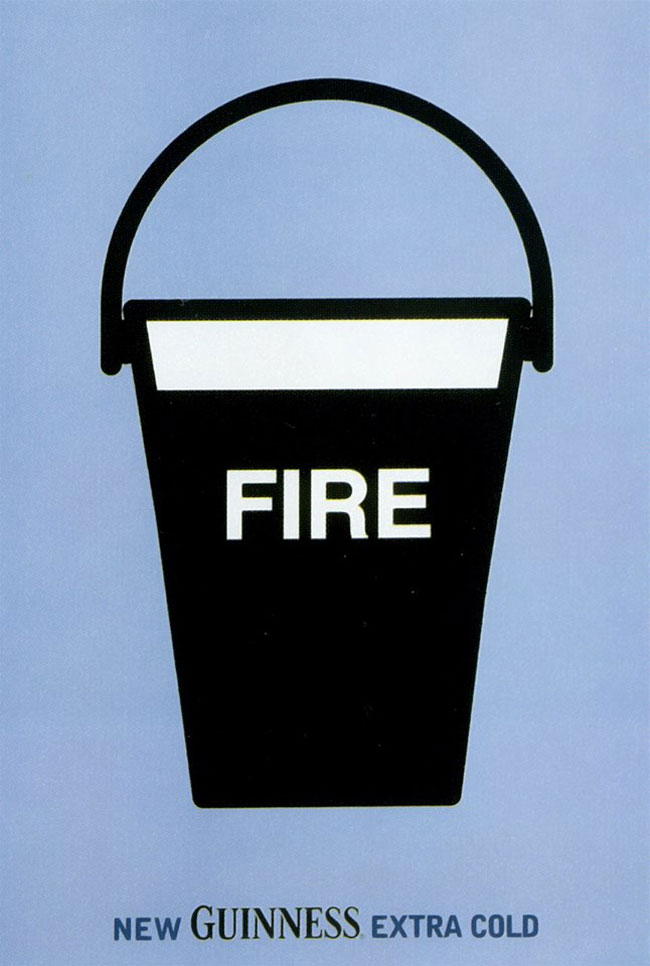
They won a yellow pencil for “consumer posters” in 2000.


Comments

10 responses to “Guinness Extra Cold posters”

  1. Jon Clark Avatar
    Jon Clark

    Very nice – reminds me of the similarly simple ideas for the “Boddingtons – the cream of Manchester” campaign 20 years ago.

  2. Really love what Guinness has been doing lately. Especially the amazing commercial they put out the other week.

  3. @Josten Are you talking about the ad where it looks like you’re floating underwater? Apparently a few divers risked their lives to get that underwater shot. Incredible stuff.

    I absolutely adore these poster designs. It goes to show that simplicity is all you need to convey a strong message.

  4. These remind me of some brilliant swiss-style posters I saw a while back — but can’t remember where. Each poster depicted a popular TV show through one simple object that represented the show. i.e. a speaker for “Charley’s Angels”. I just love it when such a simple object can communicate a deep message.

    Anyone know the poster series I’m talking about?

  5. I will say this, I like that it seems like the designers who created these are going back to the roots of design but I actually found it a little dry. Now I know saying that people will probably jump down my throat but its just how I feel. If they may have changed the colors up a little, maybe different hues of blue, it could have been different for me, but thats just my opinion.

  6. There were some great Boddingtons ads, Jon. The ice cream cone is the one I remember the most.

    That rings a bell, Seth. Too quietly to picture them unfortunately.

    Rocky, differences in opinion are always welcome. 🙂

  7. I love the posters because the message is clear and creative. Today, very often people say that some designs are too simple and even look empty. I say: The reason why we start a campaign is to send a message.
    Thanks for a nice post!

  8. I remember these from the first time round, David, and they still look fresh 13 years later. Simplicity works for me.

  9. Clever and creative with beautiful graphics – love the ice pop design and want it to be real!

  10. Amazing, so simple and effective.

Leave a Reply

Your email address will not be published. Required fields are marked *