A brand name with a suggestion can sometimes suffice.

Agency: TBWA Praha, Czech Republic

Agency: Publicis, Paris, France
Agency: Euro RSCG, Singapore


Agency: Publicis, Paris, France

Agency: Saatchi & Saatchi
A brand name with a suggestion can sometimes suffice.
Agency: TBWA Praha, Czech Republic
Agency: Publicis, Paris, France
Agency: Euro RSCG, Singapore
Agency: Publicis, Paris, France
Agency: Saatchi & Saatchi
Wow, these are really creative! It really catches your attention and makes you figure it out. I especially like the last one, really funny how they stare at you. Even I would buy one of those, lol.
But of course, the brand name helps a lot here, if it wouldn’t describe that much their business, it would be pretty hard to get.
I believe that not showing your products in some cases can have better results then showing it. People are more interested in the unknown then known, therefore the ad becomes very stimulating. Your brand has to be known though, or is at least about to be revealed.
That very interesting, But in the community where I work, I’m very certain clients won’t accept it! I like the umbrella stuff, because it has no relation whatsoever with the brand.
I love the first and the penultimate images, really creative! They make you pay attention and figure out what the ads want to say.
The last image shows Wondderbra with two Ds, and the rest of the images show just one D (Wonderbra). I think someone spelling’s wrong 😮
I agree, David. It really needs sensible use. She bought an amount of bras which is not allowing her to hold the umbrella. I would be interested if girls were the creative people here.
A brave move. But then again, it’s those that get results.
I have lots of conversations with prospects and friends about advertising. Everyone wants to go the safe route and be extremely and so obviously clear about their service or product. I guess it’s hard to understand that doing exactly what everyone else does will only get you lost in the ‘crowds’.
You need to take a ‘risk’ to make something happen.
Some great concepts here. Especially the umbrella — I actually laughed aloud at that one. The double “d”s in the last logotype sample is nice as well.
Haeii David,
Hope you doing well.
I really dont get the 2nd, 3rd and last one…
Hi Mohammed, don’t worry, from all the examples, my fiancee only managed to get the restaurant one.
The woman in the second ad is using her cleavage to hold her umbrella (because both of her hands are full).
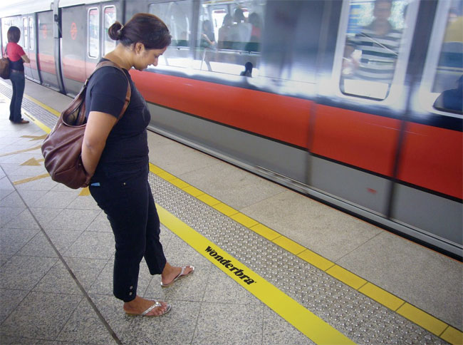
The additional safety line in the third is for women wearing Wonderbras (they need to leave extra space between themselves and the moving trains).
Edmundo, the last example is spelled with two ‘d’s to signify the bra size DD.
I haven’t seen these. They are great.
Wit is one of the greatest tools any creative has. To be able to communicate with a smile is incredibly powerful.
I really like this take on advertising, although it would certainly not work for other types of brands. I mean, if Pepsi or Coke decided to not show their product, they would never sell anything.
I like the one of every guy just staring at the restaurant. It’s funny because it is probably an accurate image.
BTW – You might want to change the directory name the images are in. AdBlockers filter it out from showing on the web page.
those are totally brilliant.
i got a question though, is it weird to show a vulgar picture like bra/breast in the west area? cause in my country Indonesia you can’t show anything like that.
LOL I guess you can not always show the product.
Hi! David,
Nice post. A very bold and creative move by the wonderbra. I agree with Kevin that it depends on the product we are selling. For other brands we may need one more ad to support it, ads with …to be continued tag. But, for product like inner wears, this is really an intelligent ad if people seeing it are ready to spend some time with their brain too and not just eyes. I liked them and also the way you explained the thought behind it. It could be anything but yours is the nearest one. And, what about the first ad, does that mean the girl is so comfortable with the bra and doesn’t mind showing off. Is it confidence that wonderbra is trying to hint? Take care and God bless all.
David,
Excellent collection of advertisements! I love wittiness in marketing.
These are great examples of marketing to consumers based on the benefit and emotions one will experience when using the product. People buy based on emotion more often than on logic. If I were in the mindset to purchase a nifty new bra, these ads would definitely peak my interest more so than the Victoria’s Secret ads, which only show emaciated women in skimpy lingerie. (May work to get men’s attention, but not mine so much!)
Thanks!
Very clever! You know an ad has accomplished it’s goal when it makes you look twice, chuckle, or ponder its message. Hats off to Wondderbra! 😉
I really like this concept of advertising a brand without showing the product, this only works if the brand is established and recognised, and some clients wouldn’t go for this concept, as how can they advertise a product when the advertisement bears no resemblance to the product.
Ahahaha, the second to last one was brilliant.
I had to revisit this today. Personally, I think the last one may be the most clever but they’re all great! I do have to disagree with the comments stating this style of advertising only works if the brand is established. In actuality it’s about intriguing the audience by providing a little mystery and building a desire in them to discover more. This is a tactic that anyone, unknown small business included, could successfully employ with a branding campaign trusted in the hands of the right designer. It’s more about finding the client willing to take a risk and invest in an alternative branding campaign, more than having an established brand already.
I remember walking the Sunset Strip in Hollywood in the mid to late 90’s (when the record companies still did something) and there were a ton of ads and huge billboards for this-band and that-band, but they were all the same: a group of guys (or girls) looking tough with either a great or cheesy logo and a call to action. They were all forgettable, I just remember that they were there, one-in-the-same. What I do remember though were the small bands with clever sticker campaigns. These weren’t just bands putting their sticker on a random wall, but a band with limited funds that had a series of stickers placed in clever spots… one band put them on every other concrete slab of sidewalk the length from the Whiskey to the Key Club and back down the other side to the Viper Room, I don’t care what you did on Sunset that night, guess who you were remembering the next day? You didn’t know anything about what they looked like or what they sounded like, but they resonated with you long enough to drive you to discover more. Even if the band sucked (which most of them did), you still remember them for their clever approach.
We have become so inundated with seeing the product (I mean really: a phone, is a phone, is a phone…or in this case a bra, is a bra, is a bra) that we don’t really see it. It’s kind of like the argument of Helvetica: so overused it’s become invisible. So the lesson to take from this is that: sometimes not showing the product can make it resonate more.
Great post David. Not showing the product in your ad is something only the “gutsy” clients will even consider.
Designer Monk — not sure if anyone else addressed this, but the first ad is saying her chest is way too big to press up against the back of the man driving.
Love these ads. Awesome.
These are all very clever – my favourite is the one with the woman standing in her bra with the black marker strokes over her chest.
Suggestion is very powerful, and I guess the same principle applies to contemporary horror movies – the less you show the greater the anticipation.
Emma, thank you for your observation, it could be but see there’s a little space still remaining in the seat. Can’t be bigger than that and I still feel that the product will make you feel comfortable even in the most uncomfortable conditions or you least care of your comfort when you just want to show, show the hidden.
Designer Monk — I see you have never had breasts while riding on the back of a scooter or motorcycle.
Designer Monk —
Three things: One, the ads are obviously greatly exaggerating the cup size WonderBra can give you or how much space breasts take up in general. Two, Perhaps you have never had breasts and ridden on the back of a scooter or motorcycle? How about with extremely large breasts? Three, “comfort” is not exactly a necessary selling point when it comes to women’s beauty. It isn’t expected, honestly, and much of the time it doesn’t exist. Women’s beauty ads don’t need to say, “this product is comfortable,” because it just isn’t expected. Desired, yes, but not necessary. They simply need to say, for example, “this product will make your boobs look huge.” Objective achieved.
Perhaps this is a bit crass, but #5 would be more accurate if all the males weren’t looking directly at the camera, but a little lower.
Either way, brilliant!
Very good and I think it’s possible to advertise anything without showing the product – you simply need to be more creative. OK, ‘simply’ is perhaps not the best word. I designed an ad for headphones that had no headphones in it, using a connection to music and music festivals. Hard to explain – I’ll see if I can find it and get a link. I like the fact that these ads make you think and, let’s face it, there are worse things we could be thinking about!
I only hope that all of these are legit and not scam because they are really clever…. The real question is that will the target market get their “cleverness” or will they be lost in the ad? I would guess that most of us who commented here are from the creative industry that is why we instantly got the message in these ads.
Kevin – I saw a pepsi ad where the logo was used to sell the brand. I think it was a billboard and they didn’t show any product shots. Imagine red skies, big blue waves and a very small photo of a surfer plus the message – dare for more. It really stood out from most of the clutter. Back in the 60’s they would always show the products with happy people in it. I think that right now everyone is tired of the “product” and it’s all about the “experience” with the product which was brilliantly shown here.
I kind of like the double-D reference.
Very, very clever. Victoria’s Secret could take a few lessons from these ads. Stop plastering boobs and butt cheeks all over and leave something to the imagination already.
I can see how most clients wouldn’t be willing to take a risk on this kind of work – just observing the comments section (and bear in mind that this is a design-savvy audience), it’s clear that not everyone will get it.
Ultimately, for a lot of men and women in suits, their priority has to be casting the biggest net and catching the most fish.
Of course if you’re a superstar ad agency or a superbrand company you can play a little with that.
Having said that, perhaps the beauty of ads like these is that there is no single interpretation – maybe in number 1 she’s wearing a dress with a low back and has secured herself to the rider with her strap? As such it’s less of a comment on size and more on the durability and hold of the bra.
The one from France made me laugh. It’s great!
Haha, David your explanations were quite essential for me. For some reason, I managed to believe that I understood them prior to reading your comment… and then REALLY understanding them!
Thanks! Very entertaining!
Robin P.
Leave a Reply