Arcano Type

Arcano Type

Arcano Type

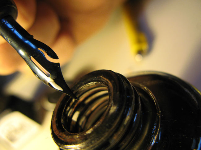
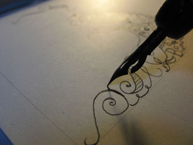
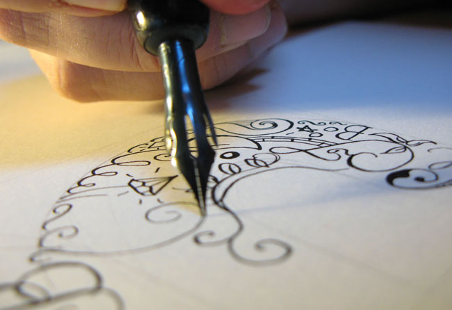
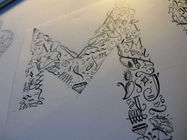
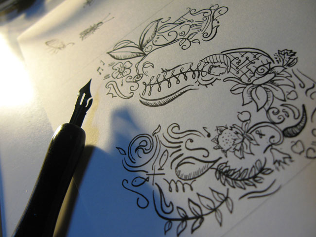
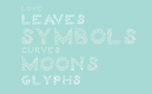
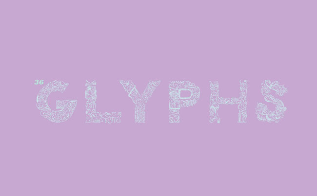
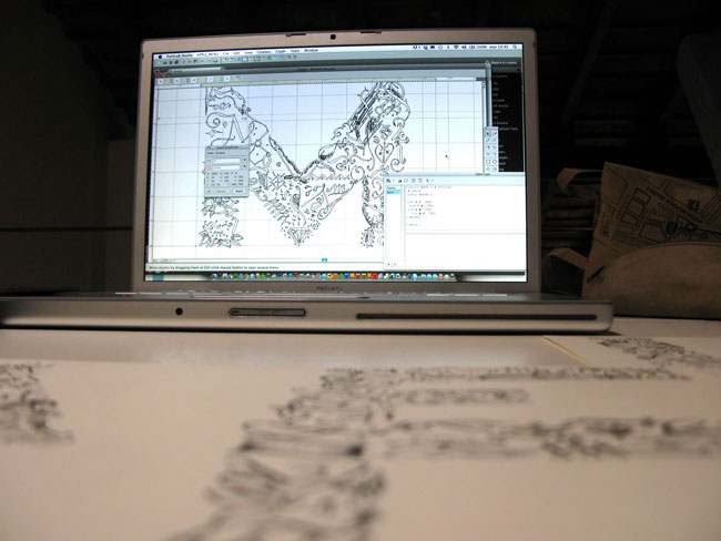
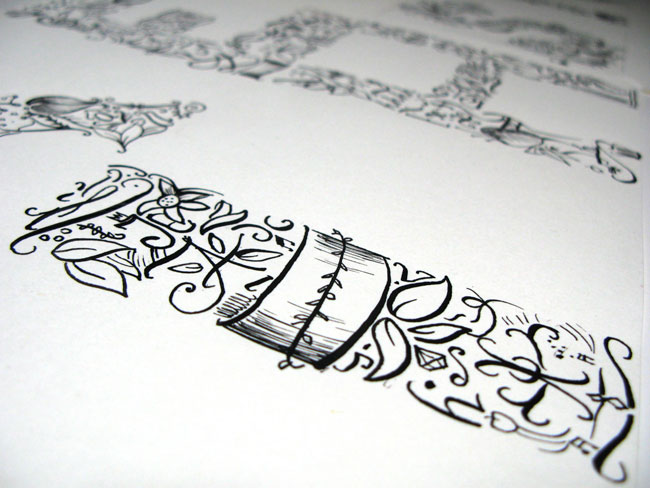
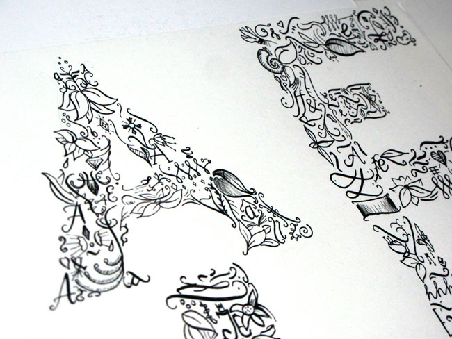
“Arcano was born with drawings of special glyphs in Chinese ink. In each letter you will find symbols, diamonds, leaves, and more. I usually work with Chinese ink because the black is always so deep and sharp. The substrate was a Japanese calligraphy paper, used because it’s smooth, bleed-proof, and the warm white of the sheets makes the ink come out even more.

“I studied calligraphy more than 10 years ago, and in a way, I stopped for a while because of my Mac. The calligraphy world is very extended and there are people that work solely in that niche. You need practice, time, patience, and of course good taste.

“I’m a graphic designer, web designer, and typographer. I have always had an interest in writing, and I developed 10 fonts last year. My studio is called Resistenza.es, basically we are two โ€” me and Paco Gonzรกlez. We have a lot of collaborators and friends who help us when we need an extra bezier.

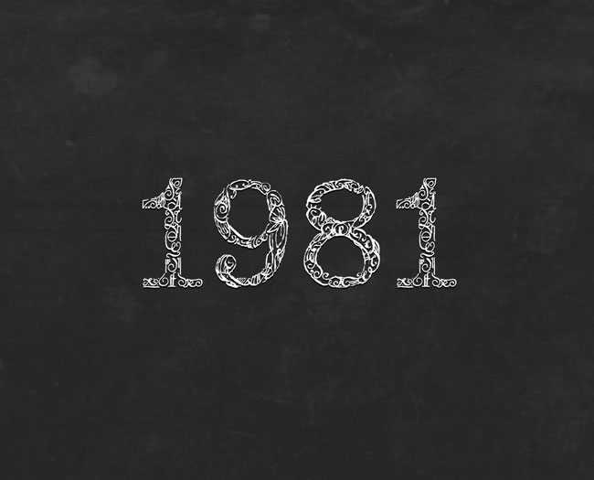
“Arcano has been scanned and traced, with Fontlab, the best typography software that I know. It was a lot of work, spanning four months, 26 letters and 10 numbers. There are no commas, dots, or accents, and I recommend Arcano Type for large text.”
โ€” Giuseppe Salerno

Arcano Type

Arcano Type

Arcano Type

Arcano Type

Arcano Type

Arcano Type

Arcano Type

Arcano Type

Arcano Type

Giuseppe kindly agreed to give five of you a copy of his true type font (or you can buy it here for โ‚ฌ30).

On Wednesday I’ll randomly select five names from the comment thread on this post, then send winners an email with Giuseppe CC’d so he can send the file.

All I ask is that you include a link in your comment to one of your favourite typography-related Vimeo or YouTube videos with a sentence or two describing what it shows (the less “views” the better โ€” I’m pretty sure we’ve all seen our fair share).


Update:
The winners are: Carlos, Juan, Mindi, Arvin, and Wendy.


Comments

48 responses to “Arcano Type”

  1. Here’s my little gem. There’s an extra scene on the Typeface movie DVD called “The Most Ambitious Wood Type in the World”: http://www.youtube.com/watch?v=_HJjKJgvb-A&feature=related

    The title is pretty self-explanatory, but it’s really a fascinating short of how artists went over the top hundreds of years ago just as they do today.

  2. Beautiful! Makes me want to whip out my sketchbook and start designing typefaces. As a matter of fact…

  3. I’m a sucker for Broadway musicals, student work, and things that remind me of sugar skull art. I particularly like what she did around 1:14, although the entire thing is cute.

    http://www.youtube.com/watch?v=-35vyRdeC0c&NR=1

  4. Would LOVE to get this, but also to see a more detailed tutorial on transferring the art to digital!

  5. Oh, and as far as my favorite video, I just really like the song AND the super simple “video” for “Still Alive”, the song from the video game Portal. It sticks with one design for the entire video, it’s super simple, but totally charming.

    http://www.youtube.com/watch?v=Y6ljFaKRTrI&feature=related

  6. This is beautiful and very distinctive. I only fear that it will be too memorable as a typeface. That being said I wouldnโ€™t decline a copy :p

  7. I love this font. Each letter looks like a piece of artwork. I don’t have any “favorite” typography-related videos. Wish I had some to share.

  8. Awesome type I gotta say!
    One of my favorite inspirations is a short interview with Alexander W. White, co founder of Miller white school of design, typographer.

    http://www.youtube.com/watch?v=mLVN7-Pedg0&feature=related

    As a design student myself, he talks to students about the importance of typography in their education.

    Hope you all like the video too!

    – Carlos

  9. I understand how a Mac can distract one from drawing on a classic sheet of paper.

    Abbot and Costello’s “Who’s on First” skit, my favorite:

    http://www.youtube.com/watch?v=ejweI0EQpX8

    Thanks Mr. Airey!

  10. It took me a few minute to find this again:

    http://www.youtube.com/watch?v=B-liHnp0h8s

    It’s just a fun little typographic animation that I thought was quite clever and the music isn’t bad either. Enjoy.

  11. Wow! Just gorgeous. Like you it reminded me of Unilever, but the calligraphic style I personally think is superior. To call it simply a ‘typeface’ is such an understatement.
    Can’t wait to see this in some unusual places, it’s going to be popular.

    N.

  12. I don’t have a video link, but I was reminded of the basic art of working with a pencil, you know the kind with lead in it, to create visually stunning work.
    http://www.leoburnett.ca/FLASH/index.htm
    N

  13. What a lovely font. It makes me want to pull out my pens again.

  14. A promo for Tesoro Publico Spain by Cocoe
    http://vimeo.com/11617381

  15. This is a video about me, working on Arcano Type, I hope you will like it.

    http://www.youtube.com/watch?v=vlFozr_1hZk&playnext=1&list=PL395EE6573EBF9D0F

    I really appreciate all these nice adjectives.

    bye

  16. My inspirational kinect typography video is http://www.youtube.com/watch?v=RL2IIpNkSKs .. “Everything burns..” =D

  17. One of my favourites has to be “The Art of Hermann Zapf”. Amazing insight into the way he works. It got me more interested in typography as an artform rather than just some text on a page and helped me to understand the intricacies of what goes on behind typography.

    http://vimeo.com/5385464

  18. Sheesh… Lukes comment made my day. Should be required viewing for all of us!

  19. awesome type though i would find it quite confusing on large amounts of text.

    i know this video isnt purely typography, but the calligraphic work on it is amazing, done by calligrapher Bonnie Ebbs for Prologue, the credits for Sherlock Holmes:

    http://www.youtube.com/watch?v=Vr2uPF83-m0

  20. A few years old, but still a fun conceptual kinetic type video:
    http://www.vimeo.com/185725

  21. Beautiful, heart felt work. I love it.

    This takes me back to design college when we were taught how to use pen and ink to create various drawing styles. I really liked this class, and the fact I couldn’t just press command delete made me well aware before I scribed. It’s like measure twice and cut once ๐Ÿ™‚

    Thanks again for sharing.

  22. The one that I love is this ( http://vimeo.com/10397984 ) by Trevor Kelley. The reason is that I love the excerpt of sound that he’s used and everything that it stands for.

    As for this typeface… wow. What effort, it’s amazing.

  23. brilliant! mostly i see font with color filled but this one is different. It’s font inside font. Great work!

  24. Wonderful font!

  25. This is beautiful. The fountain pen is the lost tool of life! I remember being forced to use one in hight school. Hated it then, but really think it was a great idea now.

  26. Wow those are so beautiful!

    I’m not sure if everyone has seen this one already, but I like the kinetic type music video for Jonathan Coulton’s Shop Vac. It’s really clever and well executed.

    http://vimeo.com/17419652

  27. The interview with Erik Spiekermann is a must watch http://vimeo.com/19429698

  28. lexusburn Avatar
    lexusburn

    Wow, what an amazing work.
    Can’t imagine how long it takes to create such a detailed typo.

  29. http://youtu.be/JBEfOmK1ab4 Calligraphy workshop with the Gabriel Martinez Meave, he’s such an inspiration.

  30. Jonathan Fleck Avatar
    Jonathan Fleck

    I’m pretty certain few other people will have seen this – but here’s a fab kinetic typography video one of my colleagues made for the HSE NI.

    http://www.youtube.com/watch?v=u8g1_Sv75C0

  31. Jonathan Fleck Avatar
    Jonathan Fleck

    A couple more:

    Lovely typographic mini-documentary:
    http://www.vimeo.com/4249739

    And of course, Cameron Moll’s ‘making of’ his typographic Colosseo letterpress print.
    http://colosseotype.com/

    Sorry for the multiple posts, this is the last, I promise! I’ve just so many favourites!

  32. Totally agree with Arvin… would love a tutorial on digitalizing this one hell of a font… Seriously well done and beautiful

  33. Carolina Maufinet Avatar
    Carolina Maufinet

    This font is REALLY beautiful! I would LOOOVE to get this font!
    Keep on with the great work!!

  34. Hallvar Hauge Johnsen Avatar
    Hallvar Hauge Johnsen

    Absolutely beautifull! I will wait untill Wednesday, before I buy anyways:)

  35. Josh Campbell Avatar
    Josh Campbell

    Very cool, I love the detail.

  36. Great! I love the font!

  37. Fantastic!
    A man after my own heart.

  38. Nice font and I like the seeing the process of it.

  39. Love this artistic typeface.

    The most abrasive typography I have ever seen are on the opening title sequence for the movie, ENTER THE VOID. I might not have been open to the dark and uncomfortable places the film went if not for this opening sequence: http://www.youtube.com/watch?v=dL0lNGXoP8E&feature=player_embedded

  40. If you like Bukowski and you like typography, look no further: http://www.vimeo.com/7616307

    Everything about the video creates the perfect atmosphere for the poem.

  41. I love this font! Great article. I have a suggestion for a future giveaway requirement; have the winner show something they have created with the winnings. Here’s a link to a fun YouTube video using typography. The song is nice to listen to as well. Thank you for the opportunity.

  42. wow i love the intricate details of this font. my link is not via vimeo or youtube, but something I saw recently over at logobird.
    http://www.logobird.com/live-the-language-series-video/
    the typography is so beautifully directed with what it depicts.

  43. Oooh Oh! Please randomly select me! ๐Ÿ™‚

  44. Why not. I’d love it!

  45. Wow, beautiful stuff up there! It would fit really well with a project I’m doing right now actually, with the Body Shop…
    Here are a couple of my favourite talks by designers, I couldn’t choose just one!
    โ€“
    Michael Bierut on Typography
    http://www.designobserver.com/observermedia/videofile.html?entry=14558

    Alex Trochut โ€“ Change for the Letter
    http://vimeo.com/16103355

    Tim Brown โ€“ More Perfect Typography
    http://vimeo.com/17079380

  46. I’ve just randomly selected the five winners, who are:

    Carlos, Juan, Mindi, Arvin, and Wendy.

    Each of you will have now received an email from me, and I’ve also given your email addresses to Giuseppe, who will send you his type design.

    Thanks for everyone’s comments and links. I enjoyed watching a few new videos.

  47. THANKS for all these nice comments, I will keep you update with my new fonts.

    congratulations to the 5 winners!:)

  48. These letter forms are beautiful but I do believe they quickly loose their clarity at smaller sizes. Not to take away from the hard work and passion that Giuseppe has obviously yshown on this project. It makes me want to get the old calligraphy pens out and have a go myself.

Leave a Reply

Your email address will not be published. Required fields are marked *