Tien-Min Liao’s handmade type

Handmade type

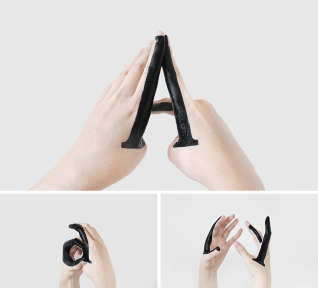
“This is a self-initiated typographic experiment that explores the relationships between upper-case and lower-case letters, and also records the transformation between them.

“In this experiment I drew shapes with ink on one or both of my hands, manipulating my gestures into the corresponding shape to signify an upper-case letter. Then, using the same shape on my hands, I manipulated my gesture or changed the perspective through which the shape is viewed in order to transform the upper-case letter to a lower-case of the same letter. Removing or redrawing the darkened shape on my hands was not allowed in the experiment. The only way to make the model transform from an upper-case to a lower-case (or vice versa) was changing the gestures or the perspectives.

“I created 26 sets of these inked shapes and drew them on my hands. Each set is made to create both an upper-case and a lower-case letter, such as A and a. I also created some italics, handwritten letters, and some new typefaces with the same shapes.”

Handmade type

Handmade type

Creative skills by Tien-Min Liao. Via inspire me now.

More handcrafted type (though not so literal) with ChickenBrainKen’s hair logo on Logo Design Love, and with these handcrafted typography posters on CreativeRoots.


Tien-Min was born and raised in Taipei, Taiwan. After graduating from National Chengchi University in Taiwan with a BA degree in advertising, she won the Ministry of Education Scholarship to advance her education at Pratt Institute.


Comments

9 responses to “Tien-Min Liao’s handmade type”

  1. Thanks for sharing this David. Really interesting, original and clever. Maybe it’s time for me to get my felt tips out…

  2. What a simple idea, executed beautifully. It’s got the uncanny, kind of dizzying quality that makes for good art.

  3. Acrobat Avatar
    Acrobat

    It’s great to see designers are still finding new ways to communicate. This is certainly one of them. Very simple but very clever. It’s obvious a lot of work has gone into this.

  4. Probably the most orginal concept I’ve seen in a long time – liked it.

  5. Michael Wargari Avatar
    Michael Wargari

    An example of how simplicity turns into a great idea!
    I also wonder how did you insert these moving graphics into your blog.
    Is it a new plugin?

  6. meredith Avatar
    meredith

    OMG!! Can this be my favorite post of the past 3 years?? OHHH I think so!

  7. This is SO creative.

    I love the fact that not only did they showcase the individual letters, but they also went as far as to demonstrate the transition between upper-case & lower-case. This takes hands on to another level. Very innovative indeed.

  8. This is really one of the most inspiring things I’ve seen in a while – I’m excited about bringing handmade things back to the web – Do you think that handmade graphics contribute significantly to percieved value?

  9. This is pretty amazing. I’m currently taking a typography course, and I think that this is a great way to see how different letters work, how they take shape, and how you can manipulate them. Definitely passing this post on to some friends.

Leave a Reply

Your email address will not be published. Required fields are marked *