Remove the logo. Know the brand.

I asked Twitter to name brands you can visually identify without the logo. Here are a few clues from your suggestions — a reminder that identities are more than just wordmarks and symbols.

Adidas stripes
Image credit

O2 bubbles
Image credit

Absolut bottle no label
Image credit

Science Museum typeface
Image credit

Apple Wallpaper
Image credit

Paul Smith purse
Image credit

Coca-Cola bottle contour
Image credit

Converse
Image credit

Honda slogan
Image credit

Macmillan poster
Image credit

Big Mac
Image credit

Ikea instructions
Image credit

Burberry tie
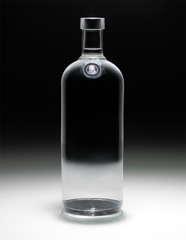
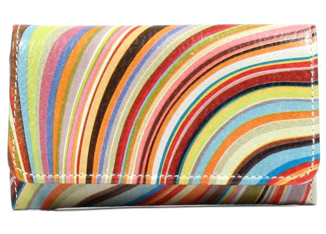
Image credit: suitored.com

easyJet uniform
Image credit

Guinness head
Image credit

All your replies:

Apple (@chrismcobble)
Coca-Cola (@limpa)
O2 (@internalmachine)
McDonald’s (@keyondesign)
Absolut, Target (@AnnLikesRed)
Marlboro (@twotribes)
Nike (@AnkitBathija)
Macmillan, Waitrose (@stephenkelman)
Dyson (@iandevlin)
RAC (@LiamSwift87)
Cadbury (@thecardbiz)
Guinness (@MacRamsay)
Burberry (@cog_design)
Twitter, Converse, Vans (@jclin1)
Cath Kidston (@gray)
Toyota (@hanux9)
Goodyear Blimp, Geico (@duomark)
M&S, The Science Museum (@michaeldowell)
Starbucks, Red Bull (@thegighandle)
Easyjet, Paul Smith, Orange, Louis Vuitton (@leejdavies)
Adidas (@QuietBritAcc)
Ikea, ESPN (@uberryan)
Lidl (@caffeine_code)
KFC (@cristirus)
Kleenex (@josiahsprague)
Jif (@sjgreen)
BP (@BlairThomson)
Cleveland Browns (@BrandMooreArt)
Lego (@ben_gc)
Volkswagon (@markbowley)
Pepsi (@juanmagdaraog)
Dyno-Rod (@KieranHarrod)
Honda (@minxlj)
UPS (@AndrewKelsall)

Depending on who you ask the list could include almost any brand name. Shapes, typefaces, colours, patterns, illustration, photography… they can all play their part.

Related:
Colour in branding, on davidairey.com
Remove the logo and still know the brand, on LDL


Comments

18 responses to “Remove the logo. Know the brand.”

  1. todd sledzik Avatar
    todd sledzik

    Based on previous posts at LDL, I think “owning” a color scheme is more difficult than one might think.

    I think shapes and various elements of styling can be the strongest (most easily recognized and versatile) visual elements of a brand. Especially when they’re not color dependent, can be integrated in a variety of campaigns, and complement or reference the logo itself. I can’t tell you what Adidas’s corporate color is, but I can recognize their apparel at a glance, from across the room.

    David, you’re the historian. Didn’t the 3 stripes (the fashion statement) come before the Adidas logo?

  2. Great post. Really makes you think about branding in the sense of making a brand. Can people recognize you’re brand without the logo? Thanks for the fun Zen thought David.

  3. Very good – you should have included more David.

    @ Todd – I did not know the first one was Adidas – thanks for that.

    I fancy a Big Mac now though, or is it just me?

  4. Nice idea to remove the logo to distinguish the brand identity.

    Speaking of brand identity, I don’t know if you’ve seen this short film on logos, but seeing as you’re Mr. Logo, I was sure you’d like it if you haven’t already seen it.

    http://vimeo.com/10149605

    Enjoy.

  5. @Ian, I just started to watch the video link, although it’s 15 minutes long. The first 2 minutes was good…

  6. I thought the three stripes came about from the original trefoil logo, but I don’t know for sure, Todd.

    Logorama’s an amazing short, Ian. Shared a while back on Logo Design Love.

    I’ll take the Guinness instead, Dave.

  7. Wow, I like that Adidas ad! 🙂

  8. I’ve done a similar thing in lessons and seminars, and the results have always been interesting. Participants argue, for example, that the shape of the Coke bottle or the Absolut bottle, the Burberry check or the Adidas stripes, or copy like ‘The Power of Dreams’ are as much part of the brand as the logo, which is the whole point.

    I also try it with TV advertisements, but instead of trying to get participants remember the brand I try to get them to remember the product. Pretty much the only one that is universally remembered is the iPod.

  9. I have to admit some of the above I didn’t get. Slap wrist.

    A logo is only one visual element that makes up a brand, cars are a great example, take a badge off an Etype and it’s still a Jaguar. Read the back of pack of a smoothie and you will identify it as Innocent without any logo.

    At the heart of it, the strongest brands, big and small, know why they do what they do and that resonates through everything they communicate with from sound to visuals.

  10. Audio branding is another topic I want to feature, Lee. Wondering if there’s somewhere I can access various brand-specific soundbites.

  11. I am a current 2nd year student in Graphic Design, about to graduate, and my instructor was revisiting with us 2nd years about logos, and at the same time trying to teach 1st year students for the first time. She was talking about branding, and how you really need to understand the business you’re making the logo for first. I think she was having trouble really conveying it to the first years and I came across this article you posted, as I have become a fan of your blog(s). So I decided to show it to her, and the following day she had ready for us an assignment about guessing the company’s just based on visual clues like what you did here. And I really think it helped get the point across more thoroughly this time.

  12. Thanks for passing my post onto your instructor, Derrick. Glad it was of use, and all the very best with your studies.

  13. Ahhhhh…I think I’m in the wrong business. I could only identify 4 of them. Better get my nose back in some textbooks.

  14. This is pretty interesting! Corporate identity and branding is by far my favourite form of design. Missed this tweet earlier, must have skimmed past it in my feed – neat idea mate!

  15. Hey David

    Love the Post and some people are saying OMG I do not get some of them but what people have to understand about branding is that in some Parts of the world brands are different for instance in the middle east it’s not the Red Cross its more a crescent shaped identity so people from that area would not understand images related to the western brand. I did not get some of the images either because I may come from a different area than where those brands advertise or not advertise. Loved the Post and Branding is my very big love affair.

    Cheers keep up the wonderful posts they inspire me to do great design.

  16. Thanks for the props, Sonny, Ryan. Here’s a little extra info on the Red Cross logo (and how the Red Crescent is used in some countries).

  17. Lauren S Avatar
    Lauren S

    When is this macmillan campaign from? trying to find out some more info about it but couldn’t find it on the site.
    Cheers

  18. A logo does not maketh the brand. Surprising how many don’t understand that. A couple I didn’t recognise since I’m an Aussie. Is O2 still around? I only threw my O2 phone in the bin last week.

Leave a Reply

Your email address will not be published. Required fields are marked *